
Mobile device users are rising exponentially with easy access to Internet. The ease of using a mobile for all online access is incomparable. Most businesses realize this and perhaps it is one of the main reason why we see heightened engagement on mobile platforms.
So, how does responsive web design come into the picture? Well, a responsive web design adapts and customizes your page in an easy-to-read format. It’s an approach that responds to the user’s demands based on screen size, resolution, platform used and orientation.
It comprises layouts, images, flexible grids, along CSS media to accommodate the required resolution, image size and scripting. It is expected to respond to the user’s preferences and requirements. With this technology in hand, users do not need different designs for various devices.
For example: if a user is required to switch from a laptop to an android mobile device, the website should automatically facilitate the switch from a laptop to a mobile device by managing the resolutions.
Why is it necessary to make a WordPress site responsive?
With a growing online presence, it has become inevitable for businesses to gear up to update and enhance their online performance. Making your websites responsive is one way to boost your appearance online. As it offers the facility of multi-screens, your business can gain leverage by attracting more consumers coming to you with more preferences.
By investing in making your WordPress sites responsive, you represent your readiness in providing the best and seamless services to your clients.
Advantages of responsive website design
The need of having a responsive website design has established so far. Now let’s get to know about its advantages:
- Lower costs for website development and maintenance
- Finer and compatible user experience
- Simpler website management
- Enhanced SEO (Search Engine Optimization)
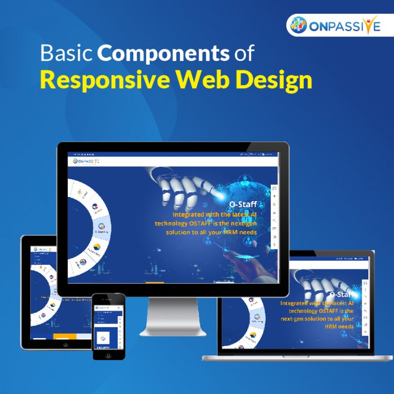
Basic components of responsive web design
A responsive web design deploys a technique that actively adapts to various browsers and device types by switching to the required layout view and content.
Following are the three key components of responsive web design:
- Grid layout: to build a layout that is flexible enough to resize to screen size automatically.
- Image and text size: As the user’s web page area changes, image and text size changes to a more scalable size.
- CSS (Cascading Style Sheets) media: It provides modification in the website design according to the browser window’s size.
Web designs and mobile site
Web designs
Responsive web design is accessible with any screen size, and it fits automatically to the user’s screen. With responsive web design, you can deploy a single layout for various browsers and resolutions. It exploits media queries to adjust text, images and layout to enable sites to appear well on different screens.
On the other hand, adaptive design deploys multiple fixed layout sizes to fit the particular screen. With this design, you can maintain a single site of multiple versions to fit someone’s device.
It is quite challenging to implement adaptive design due to some technical aspects, and it’s not always easy to design your page for the common screen widths.
Mobile Site:
It refers to a separate website version that is designed just for mobile users. It is built over a new domain to better fit on small screens, and it is expected to offer the same user experience as other devices.
As mobile sites are designed for mobiles, they won’t go well with other devices. Also, it’s a bit tough and time-consuming to keep two sites with different domains at once.
What does it take to build an excellent responsive design?
Following are a few points to let you know the do’s and don’t s of an excellent responsive design:
- Planning is a prerequisite:
- Keep your audience in mind while working on UI design
- Estimate product features and builds the content accordingly
- Be mindful of what’s working and what isn’t by implementing hover effects as and when requires
- Use icons appropriately
- Enlarge button sizes
- Prioritize A/B testing
- Typography
- Minimalism page load time
- Selection of media files
- Accessibility
- Easier navigation
- Regular testing
Responsive WordPress website with visual composer
Visual composer allows a code-free way to create a responsive website. It enables your website design to adapt to mobile devices automatically. With visual composer, changes you have made in the editor will also appear on all screen and devices.
It also offers custom responsiveness that will adjust and manage column stacking. It facilitates stacking control to enable the content to be displayed in the proper order.
It offers various design options like adjusting backgrounds, margins, paddings, adding animation effects etc., for a better user experience. It allows the control of layout display so that you can show or hide elements as per the requirement.
It helps in deploying mobile-friendly content editing. You can check your website layout on any device to ensure the design fits perfectly on any screen.
