
Hi there!
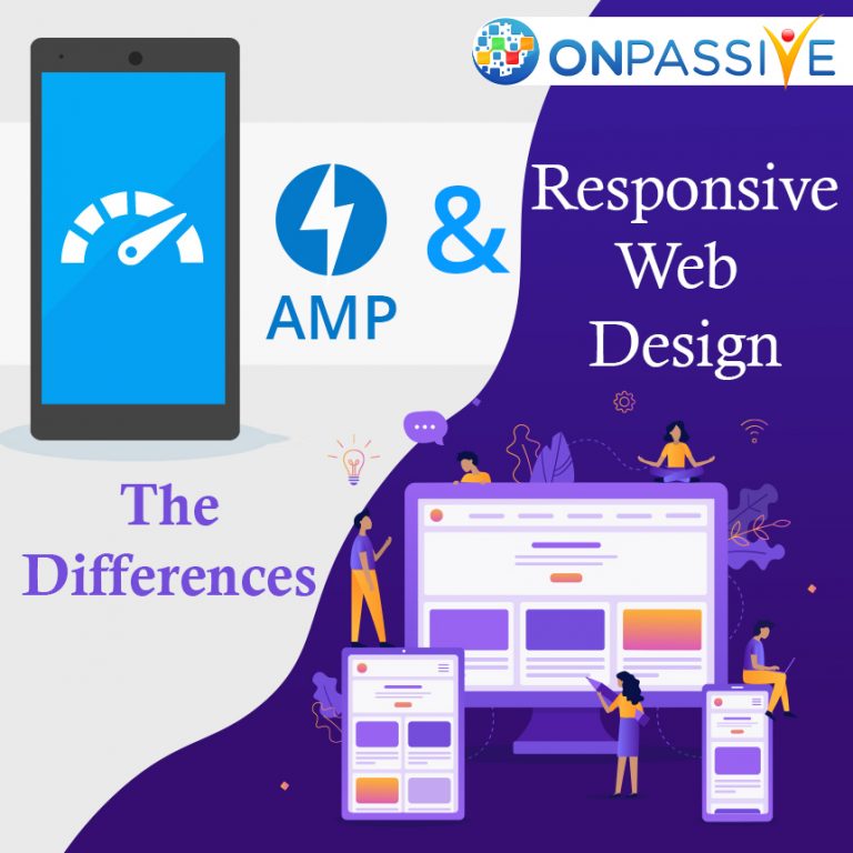
In this article, we will be looking into the major differences between accelerated mobile pages and responsive web design. They both are quite similar as they use the same building blocks for creating a mobile page.
The various programming languages that are utilized for creating a mobile page are HTML, CSS and JavaScript. In order to understand the clear differences between these two, we must learn about them in much more detail. So, let’s take a closer look into the definitions of accelerated mobile pages and responsive web design.
So, what is an accelerated mobile page?
Initially started by Google, the accelerated mobile project was started by Google in developing content to mobile devices. Accelerated mobile pages can utilize various optimization techniques, in loading pages much more quickly.
These mobile pages are specialized in making incredibly quick mobile pages. Let us look into the major differences between an AMP project and responsive web design.
What are the different goals of these type of designs?
Both accelerated mobile pages and responsive web designs can help to work on a mobile phone. Accelerated mobile pages and responsive web design have unique goals. So depending on what your end goal is you can choose either of these design formats.
An accelerated mobile project is the web framework which can be designed for instantly delivering content to mobile users instantly. These form of pages are more focused on speed rather than any other functions.
A responsive web design can help to organize and design a website which helps to work on any device from a mobile phone or a desktop computer. This type of design is aimed at more flexibility.
How else are accelerated mobile pages different from responsive web design?
Accelerated mobile pages can also work with the help of existing websites and responsive web designs can replace the current design of the website. AMP can also be added without a re-design to the site, whereas responsive web design may require an effective web re-design. This can also help to replace the existing website as well.
Some of the major applications of accelerated mobile pages are news articles, blog entries, informational pages and other types of published content.
The major applications of responsive web design are in web forms and custom applications.
In what ways do accelerated mobile pages and responsive web design affect the overall user experience?
Having an excellent user experience is fundamental and is especially great for your business. You can provide a good user experience for all of your users in trusting your organization and engaging with your website. This will make it more likely in sharing it with your friends.
The search algorithm of Google is designed in favouring websites which provide a great user experience. The two major indicators of improving the user experience are in making it mobile-friendly and improving the speed as well.
Responsive web design can help to deliver a mobile-friendly website but often fails on speed. Accelerated mobile pages project is created by Google and these mobile pages can give us a clear definition of what the mobile-friendly experience looks like.
Does your website need accelerated mobile pages?
Accelerated mobile pages are great and can help to solve specific problems such as delivering mobile-friendly published content. This is done to make the websites a better user-experience which is faster than any other form of mobile pages.
However, sometimes accelerated mobile pages can not be featured for certain types of websites and this helps clients in delivering quick and user-friendly experiences.
In conclusion, these are the major differences between accelerated mobile pages and responsive design. We hope you found this article informative in choosing the best form of design for your website!
