
Hi there!
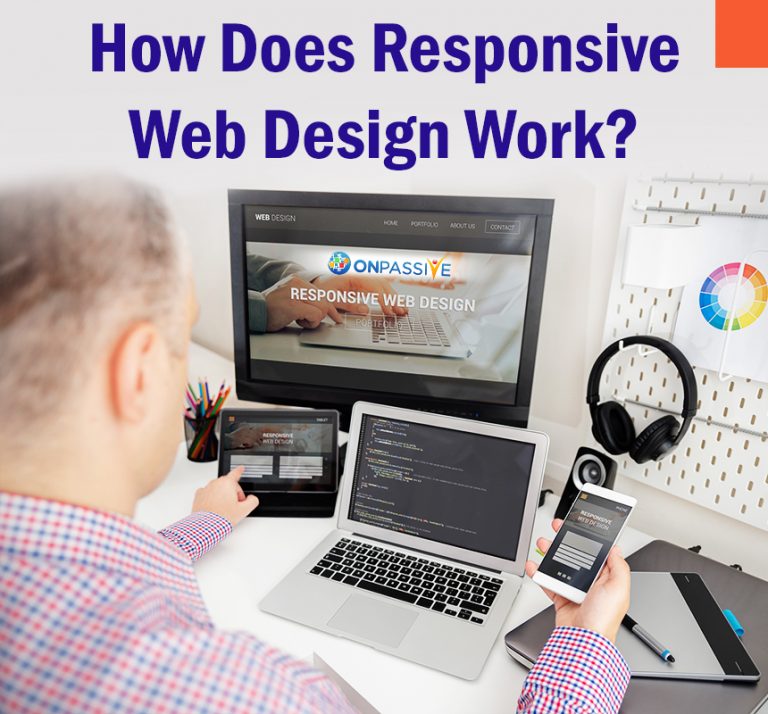
In this blog, we will be learning more about how responsive web design works and how it can significantly improve the overall user experience. Responsive web design on websites is designed in such a way, that they would look good on any site!
Basically, the concept of website design means that the design of the website must remain consistent and viewable across any platform such as mobile or the LCD screen of a desktop.
With the advent of responsive design, you can ensure that site designers can create content once and publish the same content everywhere on all the devices!
How do you define Responsive Web Design?
Responsive web design can simply be defined as ensuring the same web design is consistent across all platforms! This ensures that it follows the web design philosophy in rendering web pages in an efficient, optimized and easy to read format!
The responsive design implements newer web development features and functionality to code web pages with the flexibility, to make content visible across different sizes.
What are the main components of Responsive Design?
Responsive design for a website consists of three main components which are:
- Flexible layouts:
By creating a flexible grid, you can create the website layout to dynamically resize to any width. Flexible layouts are a staple of responsive design.
- Queries of the media:
Having an extension of media types especially when targeting and including various styles. Media queries give freedom to designers, in specifying the different styles for the specific browser and the circumstances of the device.
- The flexibility of the media:
Media should be flexible such as images, video and many others by changing the size of the media as the view size changes.
How is Responsive web design different from Traditional web design?
Traditional web design is designed on computers for web pages on desktop browsers, but when it is viewed on mobiles the same text becomes very small and unreadable.
This is due to the presence of many columns or images, which are too large to fit in the small viewport display width.
When web developers and designers focus on responsive design, web developers do not need to focus on specific display sizes but the responsive web code is designed to adapt to a wide range of display sizes.
The responsive web design code helps to present different layouts based on the size of the display and the various capabilities of a PC or a mobile device.
How can Responsive web design be incorporated into web development?
There are many different responsive design techniques, which can be used to utilize and create responsive websites. Web designers can set different major and minor width breakpoints based on various CSS media queries and a viewport tag.
This form of web design can be used to present an optimized content layout and text-based on the various display size ranges. This form of design enables the content to be more scalable based on the size of the design and platform the reader is using.
In conclusion, this was a short brief on how responsive web design works! We hope you found this article informative. In the next article, we will be looking into the difference between responsive and adaptive design.
