
Hello there!
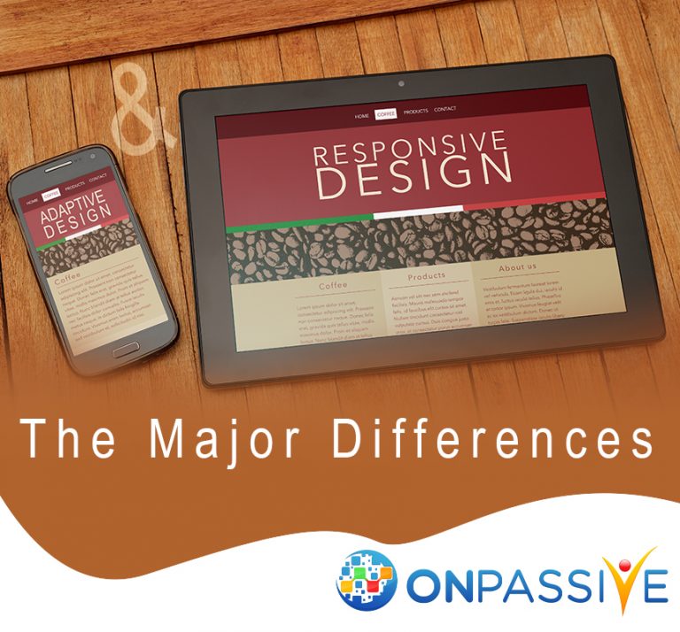
In this article, we will be looking at the major differences between responsive and adaptive design! ONPASSIVE has developed excellent responsive design techniques to ensure that websites are mobile-friendly.
A website does not have to be responsive in nature, but it must be accessible on your mobile with the help of good UX and performance. Choosing to develop a responsive, adaptive web design or maybe even a standalone mobile site.
What are the major differences between adaptive and responsive design?
- Responsive design is fluid and uses CSS media styles to adapt to the size of the screen and adaptive design uses static layouts which don’t respond once it’s loaded.
- Adaptive design uses layouts which are static in nature based on layouts, which do not respond once it is initially loaded.
- Adaptive designs require more work than responsive designs and can be more complex due to performance and display issues.
Why should you use the adaptive design?
- Adaptive designs are useful for retro-fitting to make your design more mobile-friendly.
- The number of viewports that you choose for your design depends entirely on you, your company and the overall budget.
- You can make more informed decisions by using web analytics for the most commonly used devices.
- Designing and developing a site with adaptive for multiple viewports, as it is used for retrofitting.
Why should you use a responsive design?
- A majority of websites use responsive designs, which are primarily utilized by less experienced designers and developers.
- These designs do not offer much control as much as adaptive designs.
- Responsive designs take much less work to build and maintain compared to adaptive designs.
What are the major points to consider when deciding?
When you are deciding on whether to go for an adaptive or a responsive design, it is important to consider some major factors. Responsive design requires more coding, to ensure that the website fits each and every screen.
Adaptive designs require you to develop and maintain separate HTML and CSS code for each layout. Responsive designs improve the user experience as it shuffles content around to fit the device window.
Adaptive design vs Responsive design:
The biggest thing to consider when you are deciding between adaptive and responsive design is to consider your audience and what devices they would be viewing your website on.
Once you figure out who your target audience is and their devices, then designing becomes much simpler!
In conclusion, responsive designs will always be popular but that may be because we have not found a decent solution to the maintenance that adaptive design requires. Even though the majority of the Internet utilizes responsive designs above adaptive designs, they both have different advantages and disadvantages.

ait belaid hassan
4 years ago