
The advent of technology has led to many innovations. Mobile devices are the result of such innovation. Due to the ease of carrying them from one place to another, they prove advantageous over the traditional desktop systems.
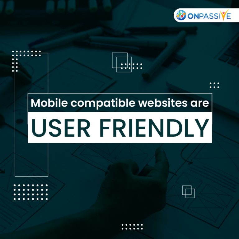
The wide usage of mobile devices requires generating a good user experience. What keeps the user engaged while using them? Imbibing all the essential user-friendly features holds the answer.
Websites -Mobile Friendly
Mobile-friendly websites would be the user choice. No one would prefer using a website on a mobile phone if it is incompatible. There are a lot many things to look into to deliver mobile-friendly websites. Implementing certain technologies are sure to generate the best results. Let us have a look at some of them.
How to improve user mobile-friendly experience?
Responsive web design
The screen size of the desktop and mobile devices are different. The text or graphics that appear on a desktop screen should be designed to fit the mobile screen without losing any data. If this criterion is not met, it may tend the user to turn away from using it.
The content being the same, the way it appears on the desktop screen and the mobile screen vary. The desktop screen is a bigger one. For example: suppose a navigational link appears on the left side of the desktop, and the corresponding content appears in the centre. This may not be possible to meet in the case of a mobile screen. The Alignment of the text may vary. The navigational links may appear on the top, and the corresponding content may be displayed below.
Responsive web design being on the top, let us focus on some other significant elements that contribute to mobile-friendly websites.
Touch or Tap: Smartphones are a significant category of mobile phones discussed during recent times due to simple and quick access to things. Touch functionality is the inbuilt feature of it. Mere by a finger touch, functionalities seem to work. So, it is essential to keep in view of this key element while designing the websites.
Efficient pages: Whether it is a desktop or a mobile device, the loading speed of the pages should be considerably high. Who would like to wait for a longer time for a website page to load? No one does. If a specific website cannot generate results speedily, the user tends to choose other websites offering the same products or services. So, let this not happen.
Generate apt content: The website content for mobile pages should be clear and concise. With the limited screen, the user prefers seeing the apt content at the first view itself. The extensive paragraphs can be broke down into smaller ones to enable clarity and focus on the essentials.
Minimize typing: Typing on a desktop is easy compared to mobiles. It may not be in everyone’s case. However, in view of some practical difficulties that arise while using mobile, it is suggested to have few fields for typing and give more prominence to view.
Be aware of the popups: Desktop screen is comparatively big to a mobile screen. Mobiles don’t have the required space to pop up. Keep watch of the popups in both cases. Popups appearing on a desktop does not hinder the regular workflow. At the same time, it enables ease of workflow. This may seem to counteract in the case of mobile phones. Instead of supporting the workflow, it acts as a hindrance. Any unfamiliarity about handling the popups will disinterest the user and eventually cause them to leave or close the website.
Conclusion
Users are more willing to opt for Mobile devices. With all the latest in-built technologies, they are undoubtedly giving the user the best experience. While coming to developing a website, one needs to implement various technologies that help achieve device compatibility. Implementing Responsive web design delivers mobile-friendly results. O-Create is a tool developed to build websites that are responsive and SEO compliant. Avail yourself the most of it to experience user-friendliness.
