
The smartphone revolution is driving businesses to new routes, and website traffic is rising with mobile phones in this current era of digital marketing. A report by Statista in 2020, 50.81% of website traffic came from mobile phones worldwide, and in 2021 this data expected to be doubled. These reports are a clear indication of mobile phones surpassing desktop usage.
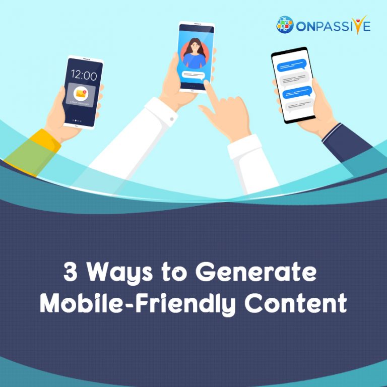
Marketers and businesses are trying to optimize their websites, ads and images to ensure mobile compatibility to increase the traffic to their websites. They are adopting three main ways to make this possible.
1. Optimizing Text:
Understanding the reading patterns of peoples is the foremost aspect in making mobile-friendly contents. There is a fundamental difference in terms of mobile reading and desktop reading in terms of content marketing.
Reading Patterns:
These reading patterns are accepted for Desktop reading based on research trials:
Golden Triangle: When people search for something on the internet, they tend to see the top left corner of the search engine page or website. It resulted from eye-tracking studies in this majority of eye movements are a triangular pattern.
F-Shaped Pattern: In F-shaped pattern people try to study the first line of the webpage, and they go down and read another line, in this way they will continue reading online contents, it’s not at all advisable for mobile compatibility because the screen size will be less.
Mobile Compatibility Best Practices:
To make your content stand out to your audience follow these steps.
Headline: Headline is the source to attract your audience, but a lengthy headline will cover majority of the mobile screen limiting the visibility. As per the suggestion of Coschedule, headlines with six words have the highest click-through rates. We can analyze the title usability on mobile devices with Coschedule headline analyzer.
Summary: Many marketers provide an overview at the beginning of their article to grasp their audience attention at the first view of the page to ensure the audience doesn’t miss important information we want to tell them in the article.
Body: Differentiating (chunking or grouping) the mobile content makes it easier to consume and is indeed one of the best practices to follow for content creation. When we differentiate a group of contents with different images and titles, it will be easier for a mobile interface user.
Different Types of Chunk Tools For Your Content:
- Images and pictures
- Styling fonts
- Bullets
- Spacing
- Short paragraph
- Summary
Shorter Is The Sweeter:
More precise and brief contents are always excellent for a mobile interface, too many phrases will not impact the audience, and they will lose the interest and leave the website or page. Simplifying contents with shorter sentences and smaller paragraphs will significantly improve the quality of content and experience for a user.
2. Optimizing Images and Videos:
As we know chunked contents like images, videos are a great way to make your contents readable on mobile devices. Memes, graphics and videos are more convenient for readers to understand a context of post. If these images are not suitable for mobile compatibility, then it’s not going to work out.
Eye Tracking Studies of Pictures:
Studies show that mobile users are more interested in images rather than reading text contents. Knowledge graph clearly states the importance of images in terms of the user’s experience as their eyes are more drawn on the pictures. These Images are acceptable if it confirms the same theory of related topic, if it is not conveying the same idea, then it is entirely distracting. To attract more users on mobile platforms, the images must and should be simple and creative to describe the relevant topic’s story.
Buffer Time for Loading Images:
When images load, many users lose their interest in continuing with the website. They tend to go back and move on to another website. Here are some ideas to make the website easy to load and speed it up:
Compression Tools: If the image files on the website are too large then there are chances for buffering and making users wait for a long time, to handle this situation, there are several compression tools for images. These tools will make images appear same as before but compress the size of the photos. For example, TinyJPG is one of the compression tools for images.
Responsive Resizing tools: Responsiveness is essential to our sites, to know if our website has responsiveness tools, we need to take the help of lyDisplay tool.
Pre-Optimized Images: These tools create pre-optimized images for social media, websites, emails and many more. Canva is a great tool to start the pre-optimization process for your images.
3. Optimizing Videos:
Every year there is a considerable increment in mobile users who are watching videos. A large number of Mobile users have been found to be watching videos that are 5 minutes or shorter. You can encourage your audience to watch your videos with the following tips
Readable Text: 85% of mobile users in Facebook play a video but not the sound, they like to read the information in the preview of the video, if they like it, then they will play the sound of the video. It is essential to make readable content for videos so that it will be engaging for mobile users.
Optimize Your Tech: Instead of hosting third party websites like YouTube or Vimeo on our site, we can use our tools to optimize our video contents by using paid tools like Wistia or Apple’s HTTP Live Streaming.
- Optimize Design
We might think content and images are enough to make mobile-friendly platforms for users. However, design also plays an essential role in making mobile platforms perfect.
Responsive Design:
Mobiles designs are not precisely responsive designs; they are used across all the platforms, it means they are adaptive in nature adjusting to the screen
Remove Sidebars:
On a desktop, sidebars are used to drag down to read the contents, but they are useless in the mobiles, as they become a reason to distract the audience.
Accelerated Mobile Pages (AMP):
These tools they haven’t been tested or widely adopted, AMP pages help boost mobile marketing curves. These HTML pages were developed and partnered by Google and its partner brands. AMP pages will get priority when people search for some queries in the mobile user section. Accelerated mobile pages are speedy, and Google is suggesting this as the priority tool to accelerate their website traffic in user-friendly mobile contents.
Conclusion:
It’s clear that smartphone revolution is building business sources to run in a high-speed format and mobile-friendly contents help make users happy. The future of business will be sourced only from mobile-friendly content due to users’ rapid adoption in terms of usage and time-saving process.
Images, Contents & Videos are the main part of mobile-friendly content generation. Businesses must adapt to leverage their websites with the ongoing mobile trends.

Radhakrish suthar
3 years ago