
Hello there!
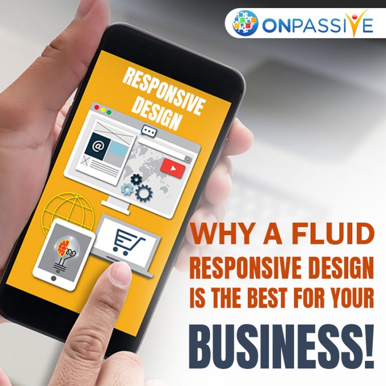
In this article, we will be taking a closer look into why a fluid responsive design may be the best design decision for your business. There are many different ways a user can view a website to be able to adjust to the varying sizes.
People use a variety of different monitor sizes and mobiles with different screen sizes and your website must always look the best. The fluid responsive design also called a liquid layout maybe the best for your business.
What are some aspects of a fluid responsive design?
- A fluid website layout also referred to as a liquid layout, contains a majority of components inside which have percentage widths and are also capable of adjusting to the screen resolution of the user.
- There are many different examples of fluid responsive design. Some of the most popular examples of a fluid responsive design such as Apple.com and comedycentral.com.
- Some designers can give a certain set of widths to certain elements in fluid layouts such as margins, general layout and percentage widths.
- Fluid web page design is user-friendly in nature, as it adjusts to the set up of the user and the amount of extra space is similar between browsers and screen resolutions.
- When a web page is designed well with the help of a fluid web page design, it can create really visually appealing designs.
- Using a fluid design but ensuring that the overall design is simplistic in nature can help to create and maintain a website.
- Doing all of this will ensure that your website is more compatible with alternate screen resolutions.
Some of the major benefits of using a fluid responsive design for your business are:
- More Fluid Grids
- Responsive Images and Media
- Media Queries
- Improved User Experience
- Overall Increase In Mobile Traffic
- Faster Website Development
- Easier Maintenance
- No Duplicate Content Penalty
- Simpler Website Analytics
- Quicker Website Loading Times
- Lower Bounce Rates
- Higher Conversion Rates
- Better SEO
- More Social Sharing
- Better Backlinks
In conclusion, there are many different responsive web design benefits for your business. In case your website is not responsive, planning a redesign with a more fluid layout is the first step.
Responsive websites can help you to determine which page elements are the most important and which pages can be eliminated quickly. You can also figure out how much copy you want to keep on your website.
Once you are clear on the direction of the redesign of your website, you can dive into the right platform and the theme for your website. Figuring out the right template for your website is the first step in your website, after which you can improve your site’s conversion rate, engagement rate and SEO.
