
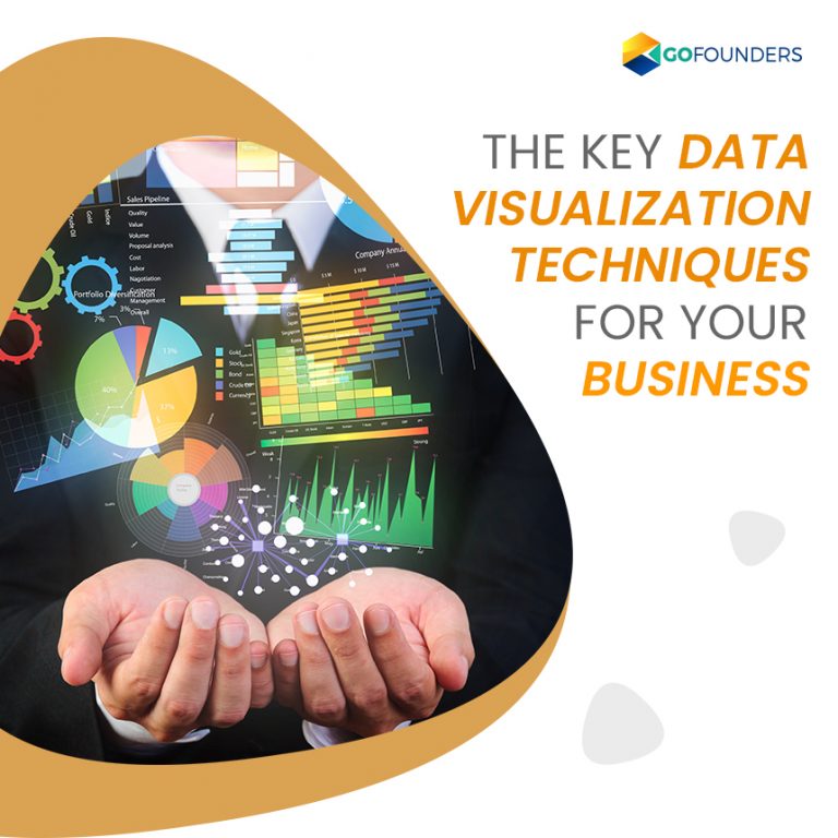
What is Data Visualization?
Data visualization refers to the graphical representation of data and information. It is a process of creating a graphical presentation of information. Visualization helps to interpret big data in real-time structure by using complex sets of numbers or factual figures and plays a vital role in data analytics.
Data visualization tools help access and understand trends and patterns in data by using visual elements like graphs, maps and charts. It is a form of visual art or storytelling with a purpose.
Why is Data Visualization important?
In the current era of Big data, visualization is an essential tool to represent the vast data generated every day. With Data visualization, data or information can be curated into a form that is easy to understand and interpret by highlighting the trends. A good visualization of data removes noise from the data, highlighting useful information.
Data is even more valuable when it is visualized. It is more essential for businesses to identify data quickly. Analysts can visualize patterns and concepts of data by the pictorial representation of information. Visualization is branching out to all fields because almost every industry is benefited from data visualization by understanding their data.
Techniques of Data visualization
Visualization of data is very crucial for the success and sustainable development of business. It helps to yield the best possible results for your business by analyzing and presenting vital information.
The top techniques of data visualization are as follows:
- Understand your audience
Your content or information needs to be inspiring and customized to your audience. This is one of the most crucial data visualization techniques because the audience views the data and understands it. These audiences could be stakeholders within your organization or your business partners or clients.
Some prefer a simple pie chart to understand the data, while others prefer a bar chart to represent information. Therefore doing proper research before representing the data helps to meet the audience needs.
- Set your objectives
It is important to have clear aims and objectives before building the management reports with visual representations such as graphs, charts and other visuals. You can create a logical narrative by highlighting the vital facts to make a structured visualization. To be successful in a specific campaign, apart from the data, utilizing the set goals and objectives helps you reach success.
- Pick the right type of chart
One of the most effective methods of data visualization is to be successful in presenting your data. Choosing the right chart for a specific purpose or a project that will appeal to the audience is the key technique.
For example, you can use a line graph to represent change over a period of time with few insights. Lines make it simple and easy for the audience to plot multiple series together.
Some of the effective chart types for data visualization concepts are:
- Number charts
- Pie charts
- Gauge charts
- Maps
- Handle your Big Data
With tons of data being generated in today’s digital world, handling your big data and breaking it down for the most focused visualization process is crucial. To handle your big data, the first step is to find out which data is available to your company and decide which information is more valuable to you. This makes it easy to separate and analyze the required information.
Make sure to use business dashboards to present the most valuable insights and help your team and staff understand how to access the data. Always ensure that your data is protected and keep your data handling systems simple to keep the process of data visualization straight forward.
- Make use of Color Theory
The most effortless data visualization technique is to choose the right color scheme for your presentation, which will significantly enhance your efforts. The principles of color theory will positively impact the overall success of your data visualization process. Make use of contrasting colors to distinguish the elements and make the presentation easy to understand. The most commonly used colors are red, blue, green and yellow.
- Make use of layout, ordering and hierarchy to prioritize
Once your data is categorized and broken down into branches of information, prioritize it by assigning visualization model and chart type for each data set. Hierarchy, layout and ordering puts the system in place and makes your representation even better which in turn makes the entire visualization process simple and successful.
- Utilize Network Diagrams
Make use of services such as network diagrams or cloud words to handle semi-structured or unstructured data sets efficiently. A network diagram is frequently used to draw a graphical chart of a network. It is mostly useful for designers, network engineers and data analysts for network documentation.
On the other hand, word clouds are used to present complex sets of unstructured information. It is an image developed with words in any context, where each word’s size indicates its importance within the context of information.
- Tell your story
Like content marketing, presenting your data in a visual form by telling a story to communicate an important message helps to engage the audience. It helps them easily understand the message with minimal effort. Visual storytelling presentation format increases the chances of communicating the most critical messages effortlessly. You can do this by thinking from a writer’s perspective and represent information with a proper beginning, middle, and end format that maximizes data visualization.
- Include comparisons
Including tangible comparisons is important while presenting your information and key insights visually. You can do this by presenting two charts or two graphs together, showcasing contrasting versions of the same information. This highlights the strengths, weaknesses, peaks and trends of the information context and provides a clear guide of your data.
- Apply visualization tools
In the present era of the digital age, for the success of data visualization you need to use digital tools which assist you in taking the best possible decisions while gathering data effectively. An interactive online dashboard is a tool that offers a comprehensive means of collecting, arranging and presenting data most comfortably and makes sure that these techniques have a significant impact on your presentation.
A collaborative and task-specific platform provides an accessible way to quickly capture, organize and display data. Data visualization techniques impact the visualization process to complete quickly and easily.
Conclusion
Many methods are available for the process of data visualization. New chart types and solutions keep coming up, aiming to create and represent more attractive and informative data representation charts. The main focus of visualization should be on summarizing the critical message through visuals concisely.
An effective data visualization is a balance between form and function. Data visualization is currently and most frequently used as a Business Intelligence (BI) tool.
